
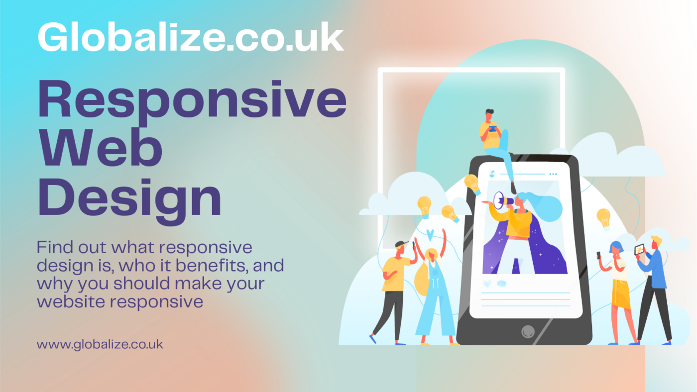
Responsive Design Benefits
Contents
Welcome to my blog post on the benefits of responsive web design! In this post, I’ll explain what responsive design is, who it benefits, and why you should make your website responsive. Stick around to learn all about building a mobile-friendly site that adapts to any device or screen size.
What is Responsive Web Design?
Definition and a brief history
Responsive web design is an approach to building websites that allows them to adapt to different screen sizes and devices. The term was coined in 2010 by web designer Ethan Marcotte.
The goal is to build websites that provide an optimal viewing and interaction experience across a wide range of devices, from mobile phones to tablets to desktop computers. This is achieved through fluid layouts, flexible images and media, and CSS media queries.
Key features
Some key features of responsive design include:
- Fluid layouts using % widths instead of fixed pixels
- Flexible images and media that rescale on different screens
- Media queries to apply CSS styling based on device characteristics
- Mobile-first approach starting with mobile styles and then adding on for larger screens
Benefits of Responsive Web Design
1. Mobile-friendly experience
With mobile internet usage growing worldwide, a responsive website is crucial for providing a good user experience on smartphones and tablets. Responsive sites are easy to use, legible, and fast loading on mobile.
2. Consistent experience across devices
Responsive design means that your users get a consistent experience of your site, regardless of the device they are using. The layout, imagery, fonts, and content will optimize for their screen size.
3. Reduced maintenance
With one responsive website, there is no need to build and maintain separate mobile and desktop sites. You only need to update one codebase and content source.
4. SEO advantages
Responsive sites only have one URL for each page, avoiding duplicate content issues. They also provide a better experience for Google’s mobile-friendly ranking algorithm.
5. Future proof
As new devices emerge, responsive sites are ready to adapt without needing constant redevelopment. Your site will continue working well on future screens and devices.
Conclusion
Responsive web design is a must-have for modern websites. With its ability to optimize sites for any device, responsive design improves usability, consistency, maintenance needs, and SEO. By taking a mobile-first approach, responsive sites deliver better user experiences across the board.
Key Takeaways:
- Responsive sites dynamically adapt to optimize for diverse screen sizes
- Key features include fluid layouts, flexible media, and CSS media queries
- Benefits include mobile-friendliness, consistent experiences, easier maintenance, and SEO
- Responsive design is future-proof and ensures sites continue working on new devices